17:31 - 28.11.2019
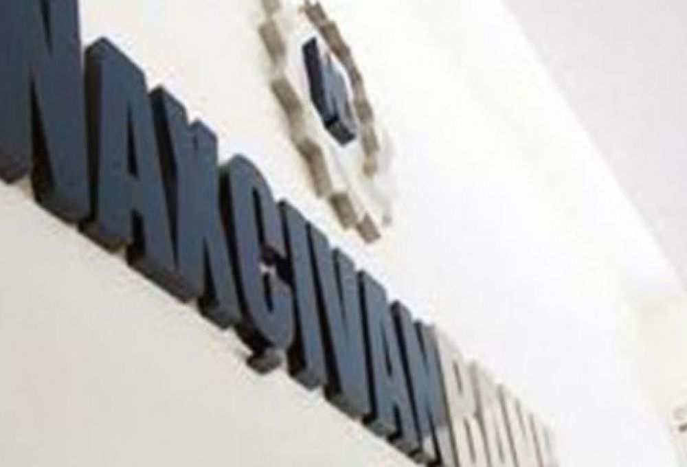
November 28, Fineko/abc.az. A range of media have reported recently that Rabitabank, which carried out the restyling (new logo, new color, new style), borrowed the logo from closed Demir Bank. According to the allegations, the Bank did not even change the color of the assigned logo. Only by removing the circle depicted on the logo, the Bank informed the public that it had restyled.
In this regard, Rabitabank informed ABC.AZ that claims in connection with the same color and logo are absolutely groundless.
In addition to refuting what was written, the Bank also provided explanations in connection with the logo: "Speaking of identical colors, it should be noted that the colors with the same code clearly indicate that the shades of green in the photos presented differ in two logos (DB - Demirbank, RB - Rabitabank). In addition, the allegation that the shapes of the logos are almost identical is itself an ill-chosen expression for such a statement. The shapes of our logo are a combination of the letters R and b and also mean communication (‘Rabita’), a combination of chat windows that are the latest means of communication. It is clear that the unfounded accusations bear frivolous and inflammatory nature. In addition, I want to note that the visual solution of the brand was proposed by one of the country’s most advanced creative agencies, and no plagiarism was allowed. In connection with the above-said, we’d like to note that the dissemination of defamatory information discrediting the business reputation of Rabitabank will be resolved in court in the future."


18 Aprel 2024
18 Aprel 2024
18 Aprel 2024
18 Aprel 2024
18 Aprel 2024
18 Aprel 2024
18 Aprel 2024
18 Aprel 2024
18 Aprel 2024
18 Aprel 2024
18 Aprel 2024
18 Aprel 2024
18 Aprel 2024
18 Aprel 2024
18 Aprel 2024
18 Aprel 2024
18 Aprel 2024
18 Aprel 2024
18 Aprel 2024
16 Aprel 2024
16 Aprel 2024
16 Aprel 2024
16 Aprel 2024
16 Aprel 2024